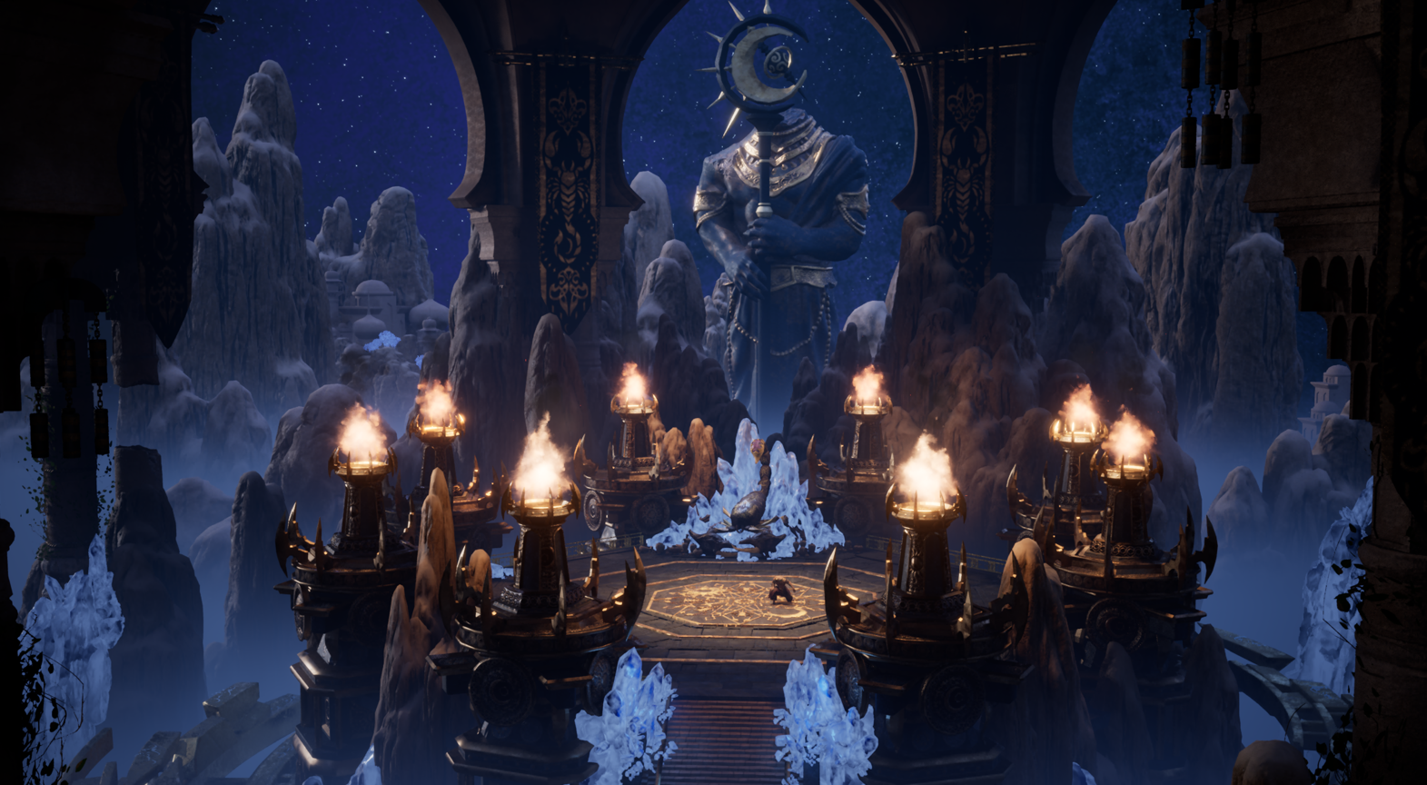
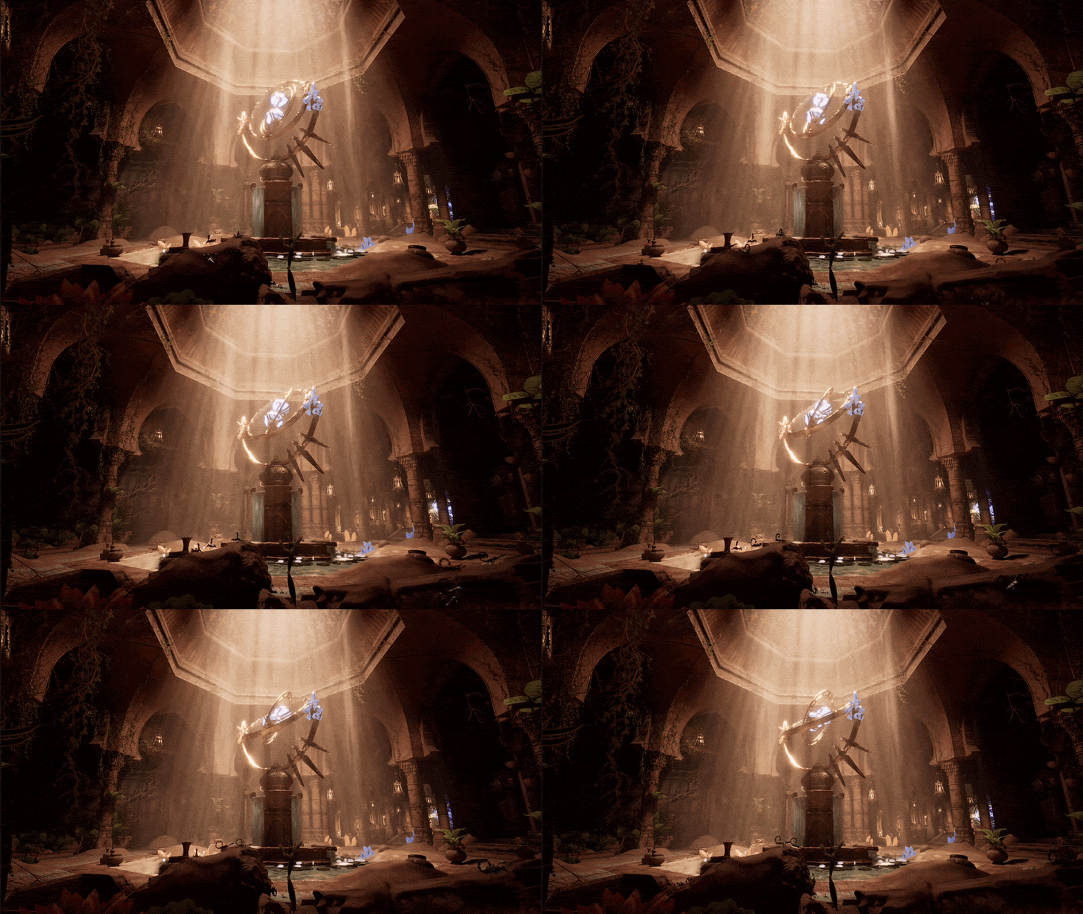
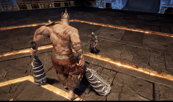
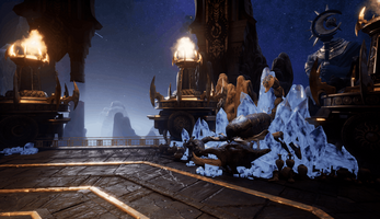
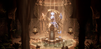
An original IP Souls-like melee boss fight developed with a team of 16 across 5 disciplines. Sunset Ecstasy centres on a modular Sun & Moon stance combat system where the player is constantly encouraged to change how they play mid-fight, backed by a bespoke HUD and a boss fight built to feel overwhelming and impactful.
Co-programming the player's combat and movement system, including the Sun and Moon stance abilities that make up our core USP.
Co-programming the boss AI and attack patterns, from simple prototypes right through to a fully polished set of animated, feedback-rich attacks and environmental events.
Owning the main character UI from first sketch to final polish, iterating on it constantly to make sure players could actually read our core Sun and Moon USP without being told.
Designing the tutorial layout and the key information the player needs, then building the tutorial events themselves so players walk into the boss arena knowing what they need to know.
Ambition. An original IP Souls-like boss fight with a 16 person team spanning 5 disciplines. The combat had to feel modular and impactful and actively push the player to change how they were playing mid-fight rather than settle into one pattern.
Constraint. Every system I owned had to be readable without us sitting next to a player explaining it. If a mechanic needed us to point at the screen for it to make sense, it was not doing its job yet.
Approach. Short iterative playtesting loops on every system I touched. Keep the ideas that landed, rethink the ones that did not, and only move on once players were interacting with the mechanic the way we intended without being told.
Four systems, each rebuilt from playtest feedback until they held up on their own. Click any iteration to open it.
The HUD is where the player reads our Sun and Moon USP. Getting it clear enough that players could work it out on their own without us explaining took four iterations.
Players liked the symbolism but nobody grasped the mechanic without us explaining it.
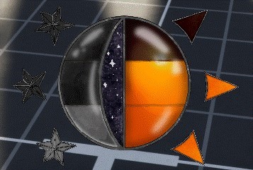
The first design had a circle split into a sun half and a moon half, with segments that filled as you hit the boss in that stance. Around it sat three healing flask segments, and filling a full side would unlock an ultimate. If the player was not consistently hitting the boss the bar would drain back to the last full segment, pushing them to stay on the offensive.
What we learned. Players liked the sun and moon symbolism, but never grasped the mechanic without us explaining. They did not realise the side segments were healing, the bar drained too fast to reward a combo, and they could not tell which stance they were currently in.
→ Find a way for the player to see which stance they are on at a glance.
A quick flame animation ended up being one of the most impactful changes I made to the UI.
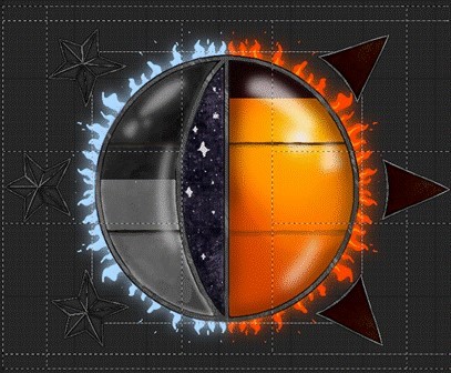
A quick change that ended up being one of the most impactful things I did on the UI. I whipped up a 2D flip-book flame animation that glows blue on the moon side when you are in moon stance and orange on the sun side when you are in sun stance. The animation draws the eye straight to the HUD so players see the change without me having to point at it.
What we learned. Players immediately understood which stance they were on and could form their own mental model without being told. Some noted it did not quite make sense that the moon had a fire effect on it.
→ Try a more custom effect for the moon side, and keep pushing the wider bar redesign.
Familiar Elden Ring inspired layout felt cleaner and more professional, but players still got confused about which stance they were on.
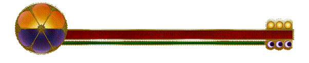
A complete overhaul of the health and Sun/Moon bar. I took inspiration from Elden Ring so the layout would feel instantly familiar, then added our USP elements on top. The sun sits on top of the bar and the moon on the bottom, with the healing charges parked on the far right. A simple red health bar and green stamina bar keep the rest of the HUD from being confused for something it is not.
What we learned. Players who had played the earlier version much preferred this one and said it felt cleaner and more professional. But some still got confused about which stance they were on, the gap between the health and stamina bar felt out of place, and players did not notice the bar filling up unless it was pointed out.
→ The UI needs more movement, and the current stance needs to be even more obvious.
Pulled all the earlier lessons together with rotating stances, glowing progress inside each segment and small orbs flying from the boss to the bar on every hit.
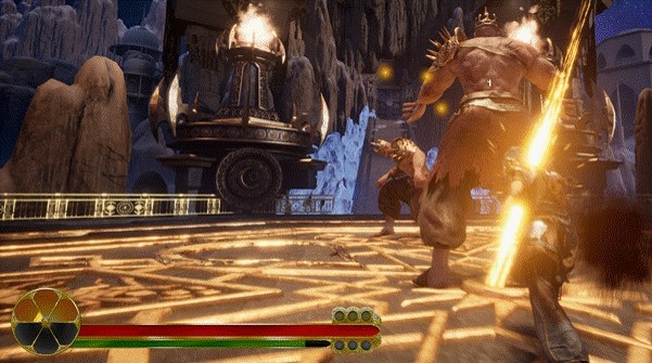
The final polish pass pulled every lesson together. The Sun/Moon circle now rotates so the active stance is always on top with the inactive one desaturated at the bottom, glowing effects inside each segment show progress, and I brought the flame effect back with a custom moon wave to fix the "moon on fire" complaint. The opacity of the effect ramps with the bar's fill so players can feel their progress.
On the charges side, an external suggestion led me to flash the last remaining healing charge so players know it is their last one. When you switch stances the matching charge type moves to the top. To sell the fact that hitting the boss is actually filling the bar, I added small orbs that fly from the boss to the bar on each hit, drawing the eye across.
Verdict. Players finally read the UI the way we intended without needing to be told. It still feels unique but every element uses UI theory the player has seen before, which is the balance we were chasing from iteration 1.
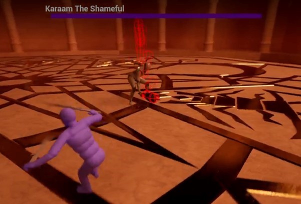
The whole game is one boss fight, so the encounter has to carry the experience. Four iterations went into a boss that feels overwhelming, varied, and impactful.
Only three attacks and no animations, so players understandably found the fight repetitive and unimpactful.
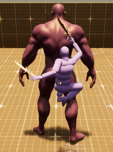
The first iteration had exactly three attacks and no animations, so the boss was still the default Unreal mannequin. That made it hard to pinpoint whether issues were mechanical or presentational, but even at this stage players called out that the attacks were repetitive and the hits did not feel like they were actually hurting the player.
What we learned. Players liked the sheer scale of the boss but everything else felt flat. Impact is not a single feature, it is a stack of small feedback tools that need to be layered on together.
→ Research feel-good techniques (camera shake, controller vibration, hit-stop, VFX, SFX) and start adding attack variety.
Players loved the variety of a jump attack and a crystal shield event, but the shield event felt like a safe cooldown rather than an actual threat.
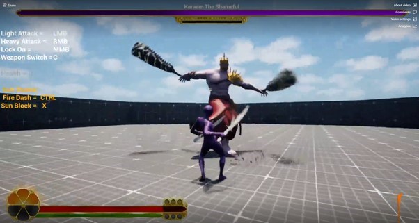
Got a placeholder boss mesh in and added two attacks that did not need custom animations. A jump attack that closes the gap when the boss sees you, and a crystal shield event where the boss retreats to the centre, spawns three orange or blue crystals that power a shield, and heals inside it until the player breaks them. The orange and blue crystals tie the environmental attack to the same Sun and Moon USP the player uses.
What we learned. Players enjoyed the puzzle of destroying the crystals and the sense that the boss could actually see them. But the jump attack slid on landing due to a bug and had no anticipation, the crystal event felt like a cooldown because there was no danger during it, and players did not realise the boss was healing.
→ Fix the jump feel, add real danger to the crystal phase (meteors), and telegraph the healing on the UI.
Meteors, criticals and a real boss mesh made the fight feel genuinely dangerous, and the critical damage exchange became the moment players kept pointing at.
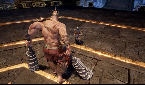
Got the proper boss model in so animators could start working, then layered on a lot at once. Meteors now fall during the crystal shield event so the player cannot sit safely. A critical damage state triggers when the player deals enough damage or perfect blocks/dodges enough times, making the boss kneel for a heavy special attack that both player and boss animate together. The health bar shifts to a crystal overlay with a green hue when the boss is healing, and turns red in critical state so players know he is vulnerable. A Juggernaut-inspired poison sprint attack rounds it out, with the boss creating AOE poison trails at semi-random locations.
What we learned. Players loved the sense of scale, the meteors added real pressure to the crystal phase, and the critical damage exchange was the moment they consistently pointed at as the most engaging bit of the fight. They wanted proper custom animations, meteors that actually track the player, and a smarter poison attack.
→ Prioritise custom animations and locomotion, then push the meteor and poison attacks further.
The final polish pass layering camera shake, controller vibration, custom animations and every other feedback tool into a boss that finally feels the way we wanted from day one.
The last iteration is where all the earlier feedback pays off. A list of what we layered on to sell the power we were aiming for from day one:
Verdict. The boss finally reads the way we wanted from iteration 1: overwhelming, varied and impactful. If we had more time I would push the phase 1 to phase 2 transition into a proper cutscene and add more environmental attacks that reshape the arena mid-fight.
The final tutorial event before the boss arena. Its job is to teach weapon switching and basic combat without spoon-feeding the player.
Blocking the intended path when there were two visible open hallways to either side was the wrong choice, and players kept trying to go around it.
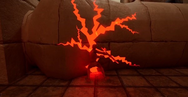
A fallen pillar blocks the corridor, with cracks that spread and glow the more the player attacks it. Enough hits and the pillar splits and flies aside, opening the path. Players understood the "keep hitting" cue but the scene felt static, two open side corridors made them think they should go elsewhere first, and some tried to walk around the pillar and hit an invisible wall.
What we learned. The glowing cracks worked as a visual cue. Blocking the intended path with two visible alternatives to either side was the wrong choice.
→ Close off the side corridors, drop the second pillar-based obstacle (we had one at the start), and try something that visually reads as an enemy instead.
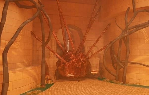
Visually much more eye-catching than the pillar, but the flesh ball had no in-world context and the forced weapon-switch pause was really jarring.
Swapped the pillar for a placeholder pulsating meatball with a subtle inflate/deflate to make it feel alive. Added an "attack with glaive" prompt, and when the player got close the game paused with a UI screen forcing them to switch weapons. Blood splatters across the walls when it dies.
What we learned. Visually much more eye-catching than the pillar, and closing the side corridors fixed the navigation confusion. But the flesh ball had no in-world context, the forced weapon-switch pause was jarring, and once players discovered weapon switching they kept toggling and got confused why the ball was not dying.
→ Find a themed obstacle, teach the mechanic without pausing the game, and make the puzzle a bit more of a challenge.
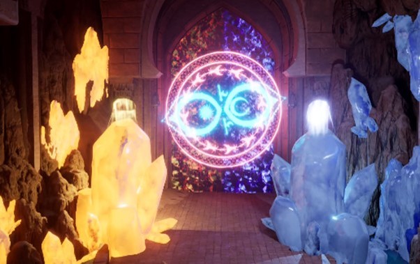
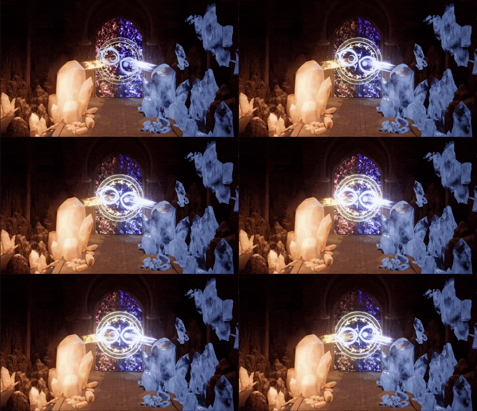
Two crystals mapped to the sun and moon stances, which also primed players for the boss's crystal shield event later in the fight.
Swapped the flesh ball for two crystals, one orange and one blue, that map to the sun and moon stances. Simplified the prompt down to an action key and a symbol. Walking up to the wrong crystal tells you to switch, then to attack. It also teaches the crystal shield event the boss uses later, so the player walks into the fight already primed for that mechanic. Breaking both crystals drops a shield that opens into the boss cutscene.
What we learned. Players loved the visuals, the fact that they had to discover the puzzle themselves, and the way the orange/blue immediately reinforced the Sun/Moon USP. Nailing the theme also meant the tutorial finally felt like part of the world.
→ Polish: crystals felt too fragile, needed more SFX/VFX, and the shield door needed to match the game's aesthetic.
A quick polish pass increasing the crystal health, adding shatter sound effects and redesigning the shield door to fit the game's aesthetic.
Verdict. The tutorial teaches weapon switching, basic combat, and the crystal shield mechanic all in one 20-second moment without a single line of instructional text.
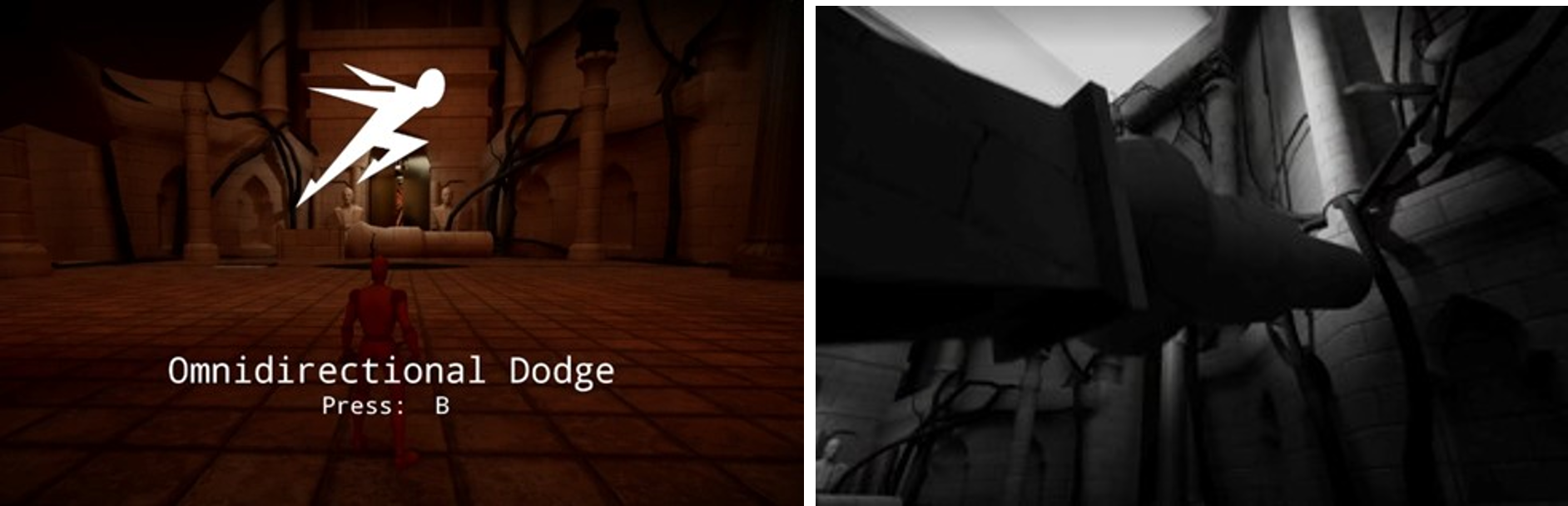
The very first tutorial event, teaching the player how to dodge. It has to make dodging feel important without killing the player before they have learned anything.
Players liked the cinematic pull-out and the QTE feel of the moment, but the tutorial popup felt spoon-feeding and there were no real stakes if you missed.
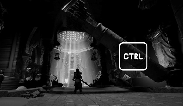
A massive pillar comes down as the camera pulls out and the scene desaturates into black and white, giving it a QTE feel. Players liked the cinematic pull-out and the intensity of the moment, and difficulty felt fair for a first mechanic.
What we learned. The blatant tutorial popup felt spoon-feeding, players could not lose so there were no real stakes, and the physics-based rock fall made the pillar feel too light for its size.
→ Kill the popup, add real consequence, tune the fall to feel weighty.
Killed the popup, added lethality and framed the camera properly so the tutorial actually had real stakes to it.
Built the pillar around configurable fall points in Blueprint so I could quickly tweak speed and shape whenever the level art changed around it. Replaced the popup with a simple action-button icon that follows the pillar as it moves. Missing the input now crushes the player and restarts the section, so the tutorial finally has stakes that match what the dodge will actually be defending against later. Added an anticipation slide before the pillar drops so the beat feels less abrupt.
What we learned. Players preferred the diegetic prompt over the popup and responded well to the added stakes. No major complaints beyond wanting more sound/VFX and a better ground-impact look.
→ Polish pass on juice.
Final polish pass adding sound effects, dust VFX and a bit more variety to how the debris spreads on impact.
Verdict. The first minute of the game now teaches the dodge with real consequence and enough atmosphere that players do not feel handled.